.svg)

How to create blog images that make complex ideas click
This guide explains how to choose useful visual formats and create them without advanced design skills.

Your article is ready. Now you need blog images that help someone understand it, and you’re back in a design tool trying to fit a paragraph into a template.
Start with the information your reader needs. This guide explains how to choose useful visual formats and create them without advanced design skills. It also covers image sizing and the SEO details to check before publication.
What makes a blog image worth reading?
A useful blog image helps your reader understand a specific point. Its message stays clear when someone encounters it while scanning the page.
Nielsen Norman Group’s eye tracking research found that people paid attention to images carrying relevant information and often ignored purely decorative pictures. For a B2B blog, that gives you a practical starting point: decide what the reader should learn from each visual.
Give each image one clear job
Choose a specific question or takeaway for every graphic. Someone should be able to explain its purpose in a sentence.
In an article about customer onboarding, a process diagram could show when the customer moves from account setup to their first useful result. A screenshot could show exactly where to complete a required action.
Both have an obvious job. You can judge whether the visual succeeds by checking how clearly it answers that question.
Try this before adding an image: finish the sentence, “This helps the reader understand…” If your answer is vague, go back to the section and find the point that needs explaining.
Match the format to the information
Choose a layout that makes the relationship between your ideas easy to see. The structure of the content should guide the design.
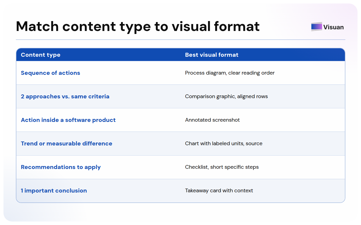
You can use several formats within one article. A comparison section and a practical walkthrough ask the reader to do different things, so their visuals can have different structures.
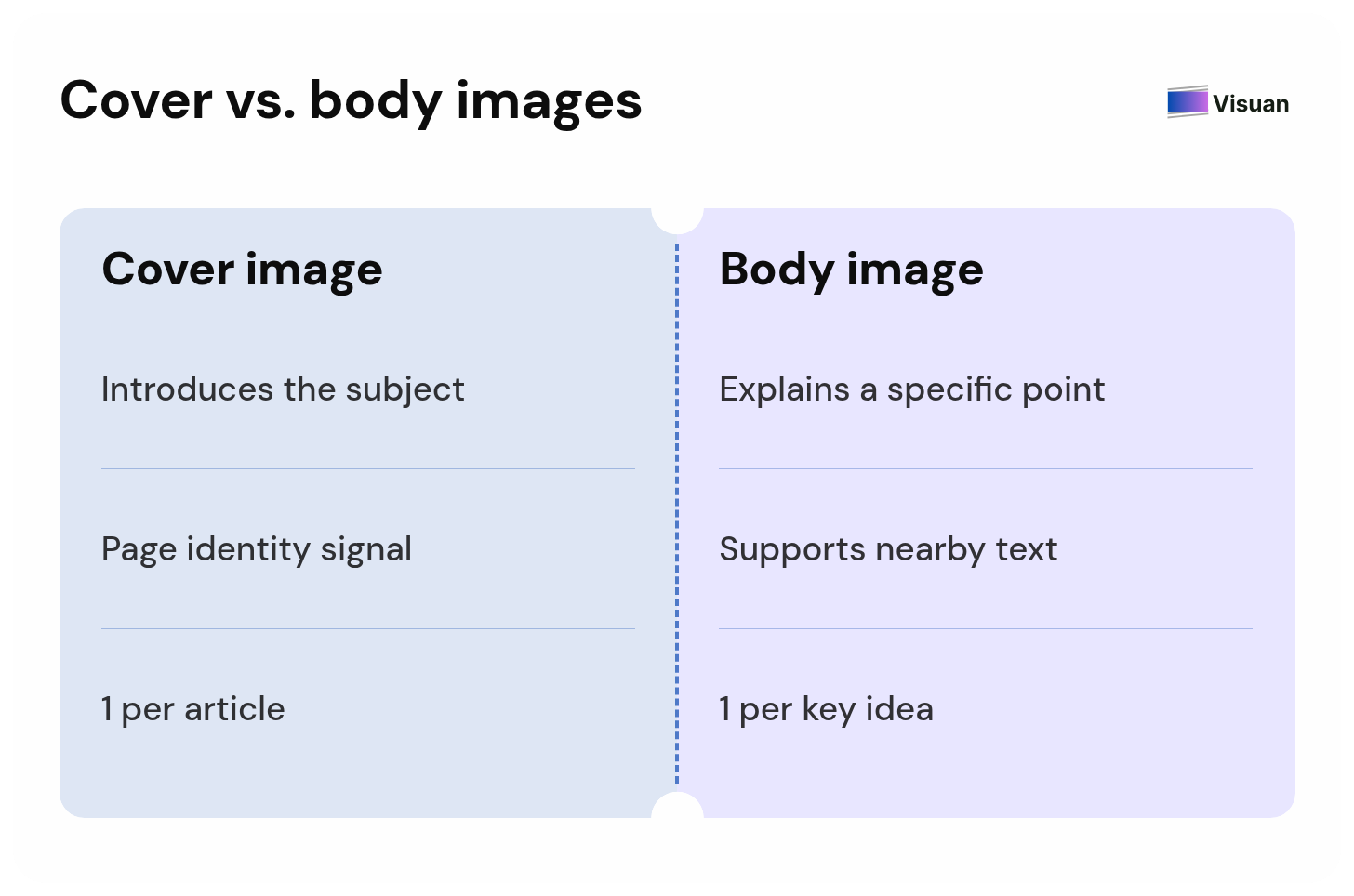
A cover image introduces the subject and gives the page a recognizable identity. Within the article, choose visuals that explain the specific point beside them. An attractive cover can coexist with a body full of unanswered questions.
For software tutorials, capture the real interface and crop to the relevant area. Leave enough context for readers to recognize where they are. A small annotation pointing to the right setting can make a screenshot much more useful.
Show the relationships between ideas
Make the visual explain how the information connects. The arrangement should help readers answer a question they would otherwise need to work through in prose.
In a process diagram, label what passes between teams at each handoff. If customer success needs an approved implementation plan from sales, show that document on the connection. The reader can see what allows the next step to begin.
For a comparison, define the criteria before writing either column. If the first row discusses setup effort, both sides need to address setup effort. This keeps the comparison useful to someone making a decision.
Preserve the evidence when simplifying
Keep the context needed to interpret a claim correctly. A shorter caption should preserve the scope of the evidence behind it.
Suppose a hypothetical campaign’s conversion rate rises from 20% to 25%. That is a gain of five percentage points, equivalent to a 25% relative increase. Label the measure clearly so readers can interpret the improvement.
Keep the reporting period visible, and link to the source beside the graphic. For a customer example, identify the customer and relevant circumstances. This also helps a visual remain understandable when someone saves it separately from the article.
Make the message readable at blog size
Check the graphic at the width it will occupy in your article, including on a phone. Every essential label should remain readable.
A design can look comfortable on a large canvas and become exhausting once your website scales it down. Long sentences are especially vulnerable. Shorten the copy, or split a crowded graphic into separate visuals with distinct purposes.
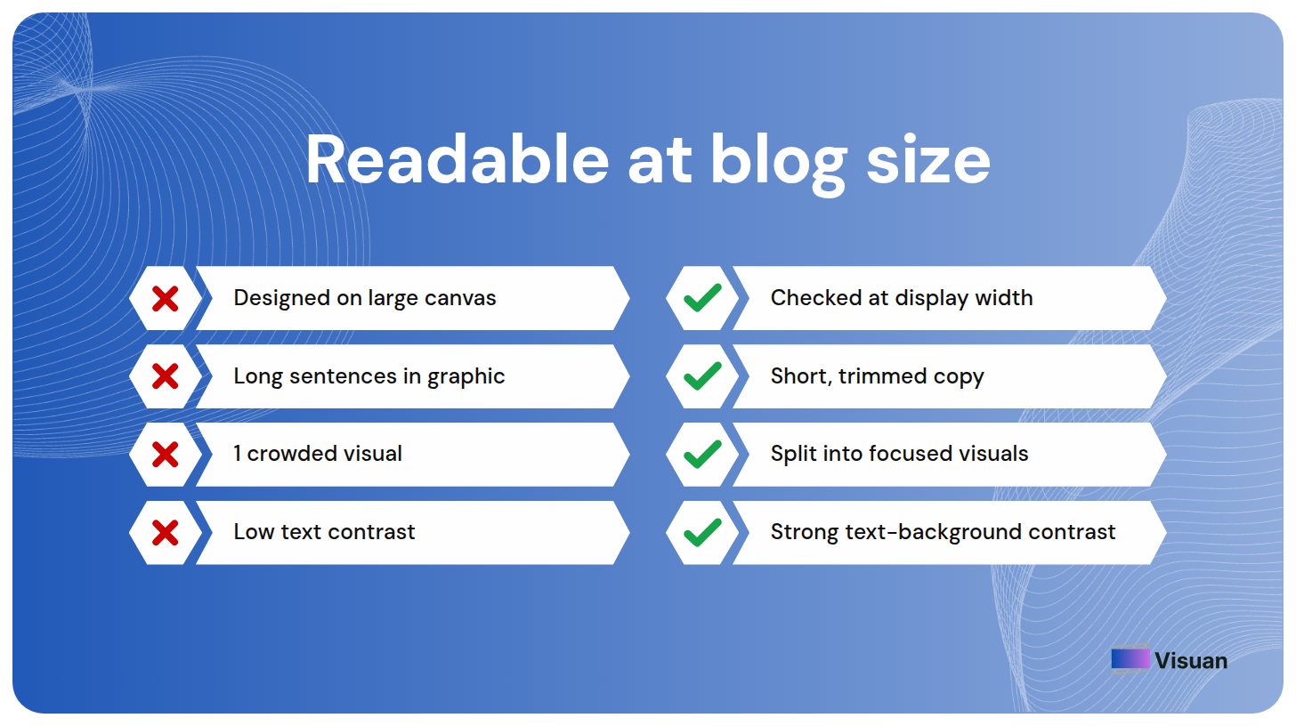
Give the main takeaway the strongest visual emphasis. Keep supporting text brief and use enough contrast between text and background. Your brand colors should help readers follow the content.
Place the visual beside the point it explains
Add each image near the relevant passage so readers can connect the explanation with the graphic immediately.
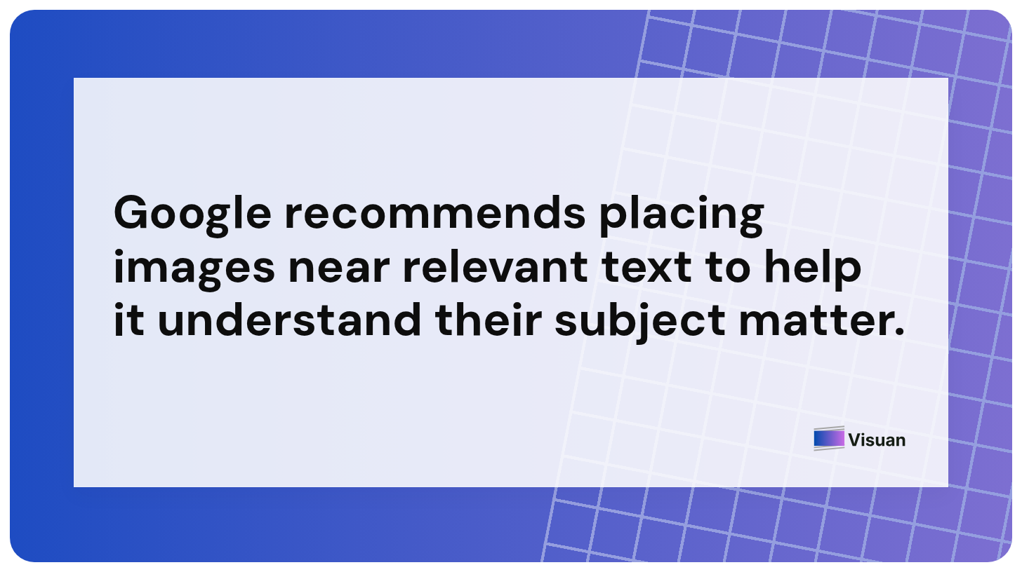
If a section describes an onboarding workflow, show the process there. A graphic several sections later asks the reader to reconstruct the connection. Google also recommends placing images near relevant text, which helps it understand their subject matter.
Choose the image count around the reader’s questions
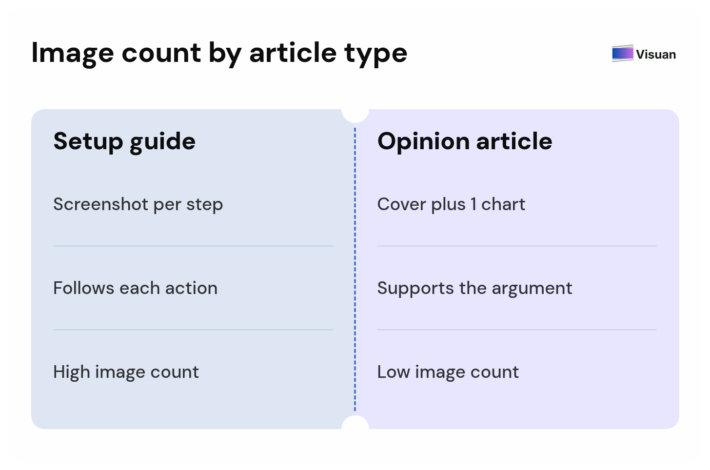
Use enough blog post images to explain the ideas that benefit from a visual. Article length alone gives you little guidance on the number required.
For example, a software setup guide might need a screenshot at every unfamiliar step. An opinion article of the same length could work with a cover and one chart supporting its argument.
To plan your images, mark the passages where readers need to compare options or follow an unfamiliar process. Give each proposed image a one sentence purpose. Review repeated takeaways carefully: a second graphic needs its own reason to appear.
Avoid committing to an image after every fixed number of words. That can put a visual in the middle of an explanation and encourage you to fill space with repeated information.
How do you create blog images with Visuan?
Visuan is an AI content designer for B2B marketing teams. It reads your article and generates branded blog graphics in one click.
It also writes the copy for the visuals. You can start with the draft you already have, then review the results using the criteria above.
1. Start with the complete article
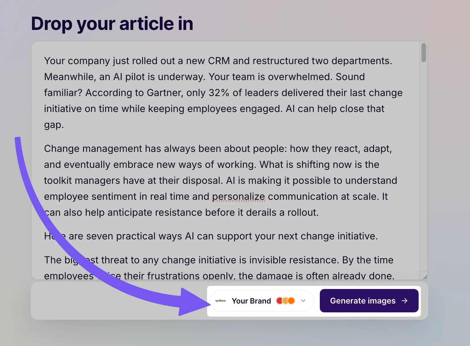
Paste your full draft into Visuan so it has the context behind each point. Keep the examples and supporting evidence in the text.
Consider an article about choosing TikTok creators. Its opening might introduce the campaign goal, while a later section explains how to evaluate audience fit. The full article gives Visuan that context when it extracts ideas for visuals.
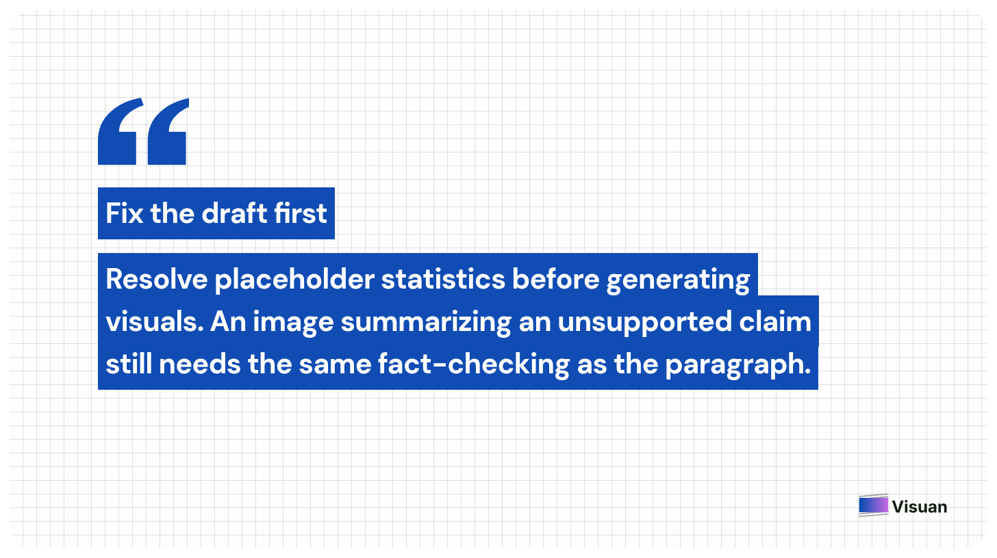
Before generating, resolve any placeholder statistics or unfinished arguments. An image that summarizes an unsupported claim still needs the same fact checking as the original paragraph.
This is also a useful moment to confirm your terminology. If you use creator throughout the article, an unexplained switch to ambassador in a graphic could suggest a different role. Consistent wording makes the final review easier.
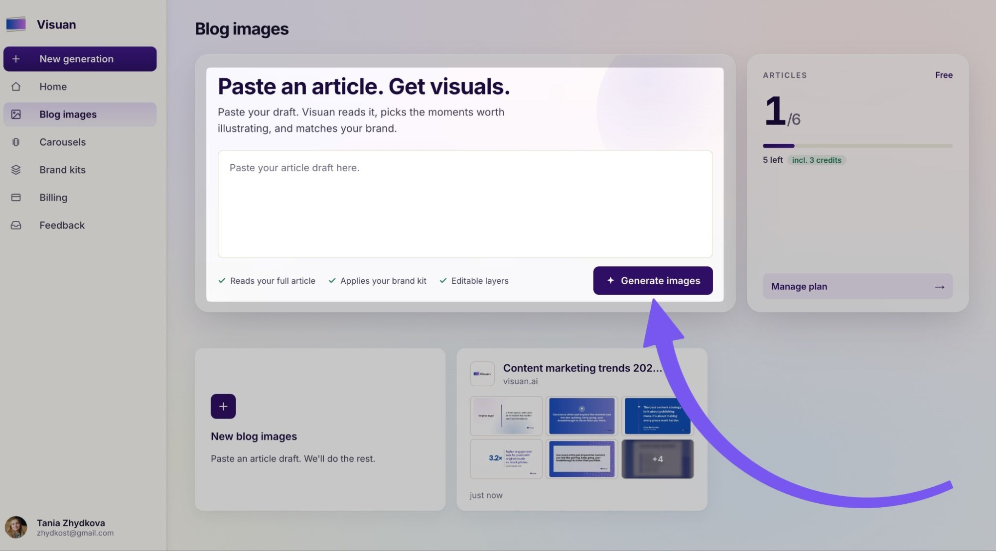
2. Generate blog post graphics in your brand style
With your brand kit set up, generate the visuals in one click. Visuan applies your logo and brand styling to the output.
The tool extracts key points and writes captions from the article. You don’t need to write separate copy for every image or drag each text block into position.
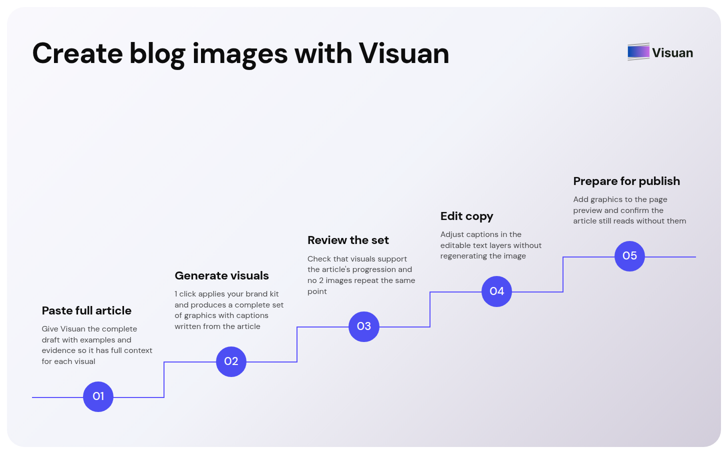
Think of this as the first complete set you can review alongside the draft. Look at the visuals together before deciding which ones belong in the article. Two individually useful graphics may cover the same point.
Check that the set supports the article’s progression. An early graphic might clarify the problem your reader is assessing. A later one can help them apply your recommendation. Each image should make sense at the moment it appears.
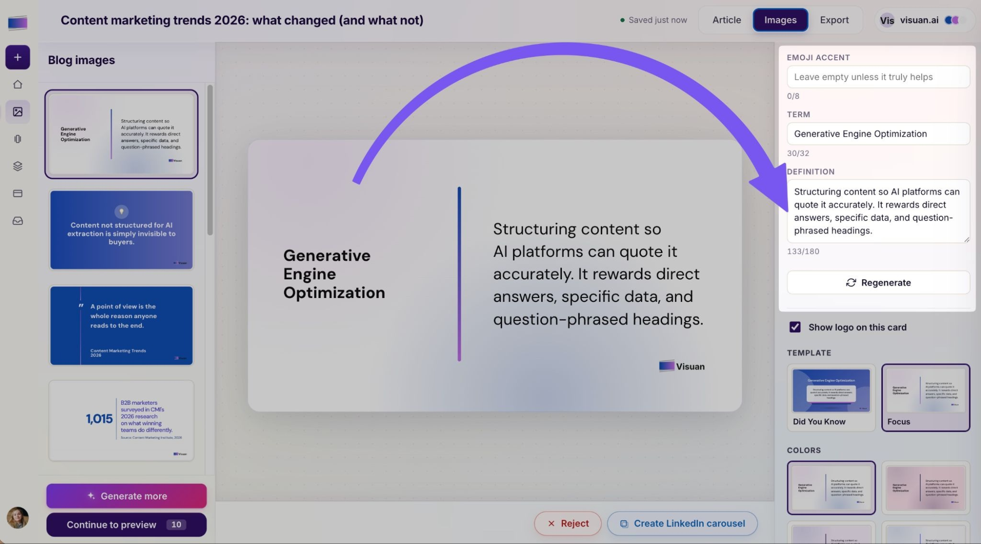
3. Edit the copy while keeping the layout
Visuan’s text layers are editable, so you can adjust a caption without regenerating the whole image. This makes small editorial corrections straightforward.
Read each image alongside its source paragraph. Check whether shortening the text has changed the meaning. Qualifiers matter: a finding from one campaign should remain specific to that campaign.
For an illustrative example, imagine your draft recommends weekly reporting during a four week pilot. A graphic headed Review results regularly loses the useful instruction. You could revise it to Review results weekly during the pilot, provided that matches the source text.
Also check the language your readers will recognize. Internal shorthand that feels obvious to your team may need a few extra words in a visual. Make those edits, then check the line breaks again at the intended display size.
4. Prepare the selected images for publication
Add the selected graphics to your article and review them in the page preview. This is where you check the reading experience as a whole.
Keep the essential explanation available in the article text. Readers should still be able to follow your argument if they use a screen reader or an image fails to load.
Before publishing, make these final checks:
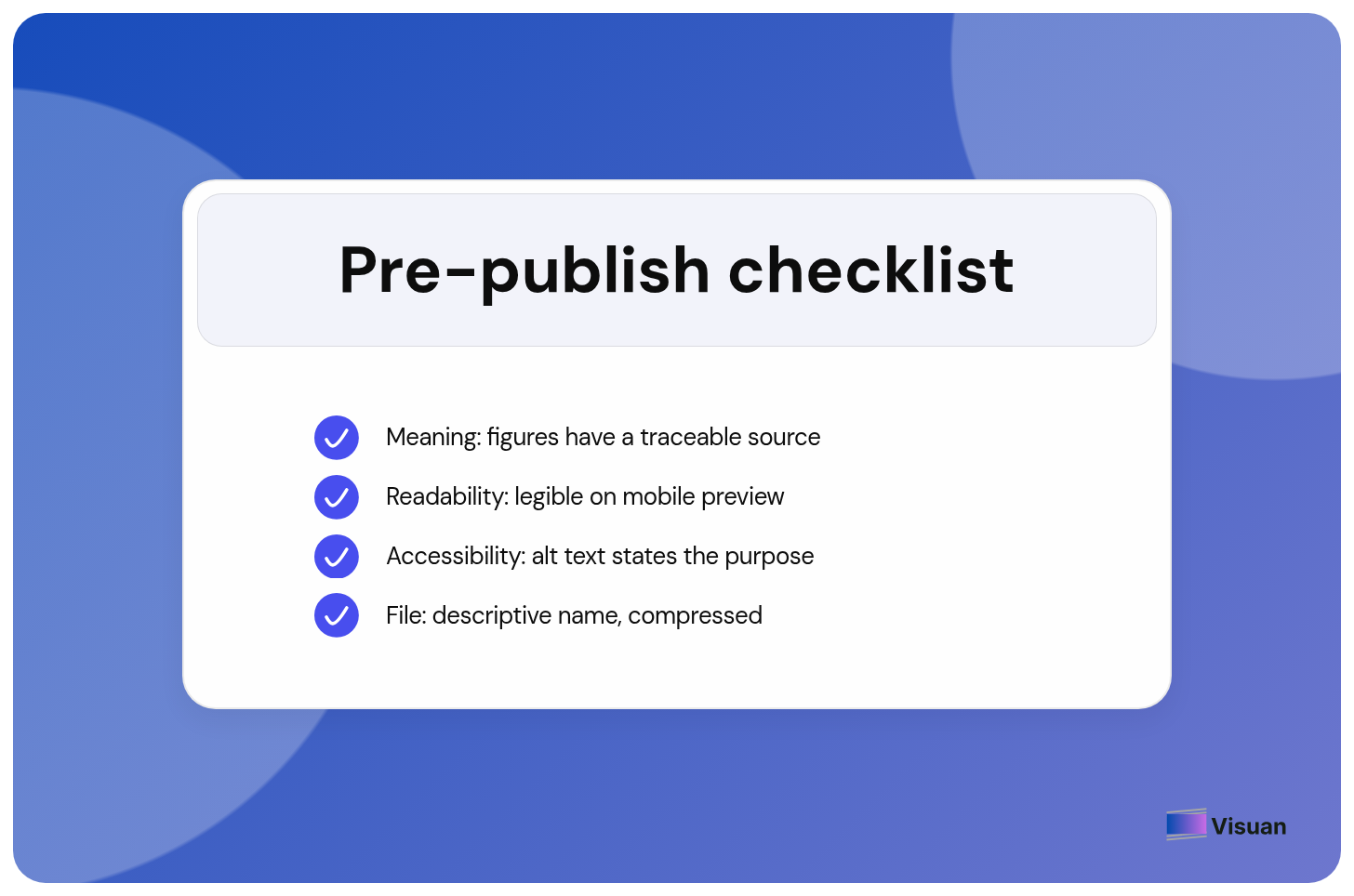
- Meaning: The graphic matches the article, and any figures have a traceable source.
- Readability: Essential text stays legible in the mobile preview.
- Accessibility: Alt text communicates the image’s purpose, with a fuller explanation available where needed.
- File preparation: Use a descriptive filename and compress the image while preserving clear text.
The sizing and SEO sections below explain how to make these publication checks part of your workflow.
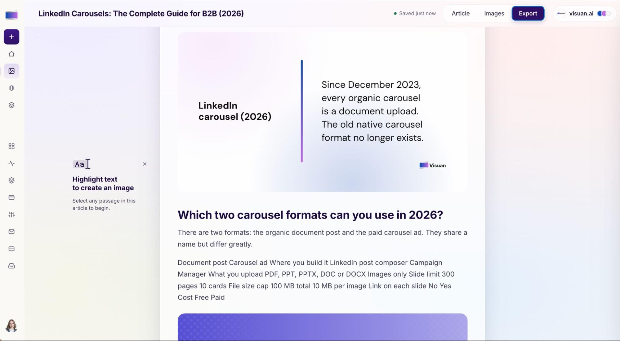
5. Reuse the content for LinkedIn
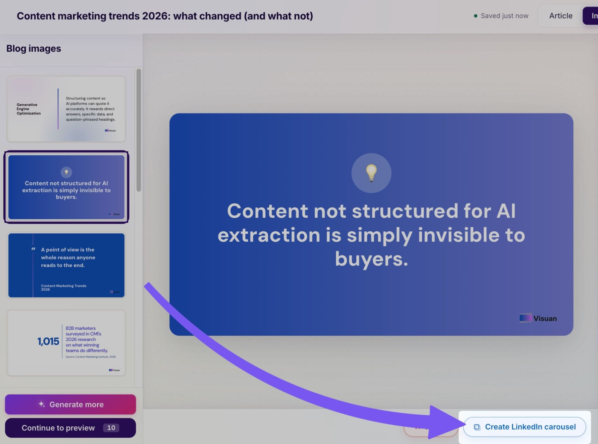
Visuan can also turn your content into LinkedIn visuals and carousels. You can export a carousel as a PDF for upload.
Choose a takeaway that makes sense to someone who hasn’t read the article. A blog graphic may rely on the paragraph immediately above it. A LinkedIn reader needs that context within the post or carousel.
For the creator selection example, the opening should identify the decision being made: choosing creators for a campaign. Then check whether the advice remains understandable on its own. Our guide to repurposing blog content for social media covers this part of the workflow in more detail.
Choose image dimensions and file formats for your blog
Base image dimensions on your blog’s layout and choose a file format that preserves the detail readers need. Preview the result on mobile.
Size the graphic for its actual display width
Check how wide images appear in your article template before choosing export dimensions. Your content column and cover image may need different sizes.
For example, a graphic displayed at 800 CSS pixels wide can use a 1,600 pixel source to provide two image pixels per displayed pixel. This supports a sharp result on screens with that pixel density. MDN’s responsive image guide explains how display size and pixel density affect image selection.
Text inside a flattened image shrinks with the image. A label set at 32 pixels on a 1,600 pixel canvas scales to the equivalent of an eight pixel font when the graphic displays at 400 pixels wide. Increasing export resolution preserves that same proportion.
Reduce the amount of copy or use a simpler composition when the mobile preview feels cramped. Keep a version with editable text so you can make those changes without rebuilding the graphic.
Choose a format based on the visual
Compare file size and legibility for the kind of image you are publishing. Different formats suit different visual details.
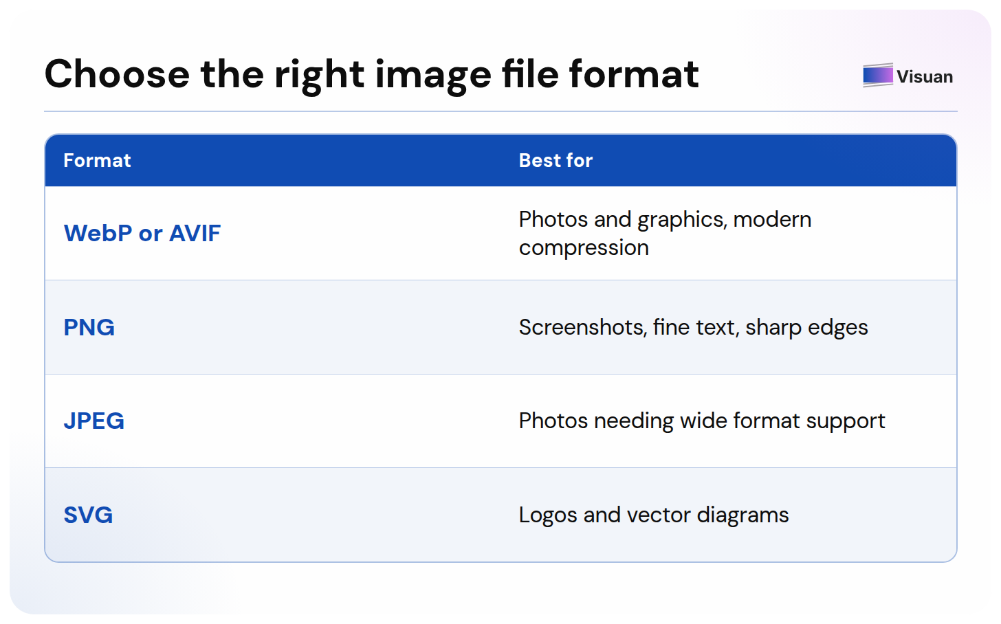
web.dev’s image performance guidance explains the compression tradeoffs. Lossy compression can introduce visible artifacts around fine text. Inspect the smallest labels before choosing an export.
Save an editable master separately from the compressed file you publish. When the article changes, you can update the source and export a fresh image.
Check the full page’s loading behavior
Review image performance across the whole article. Several individually manageable files can still create a heavy page.
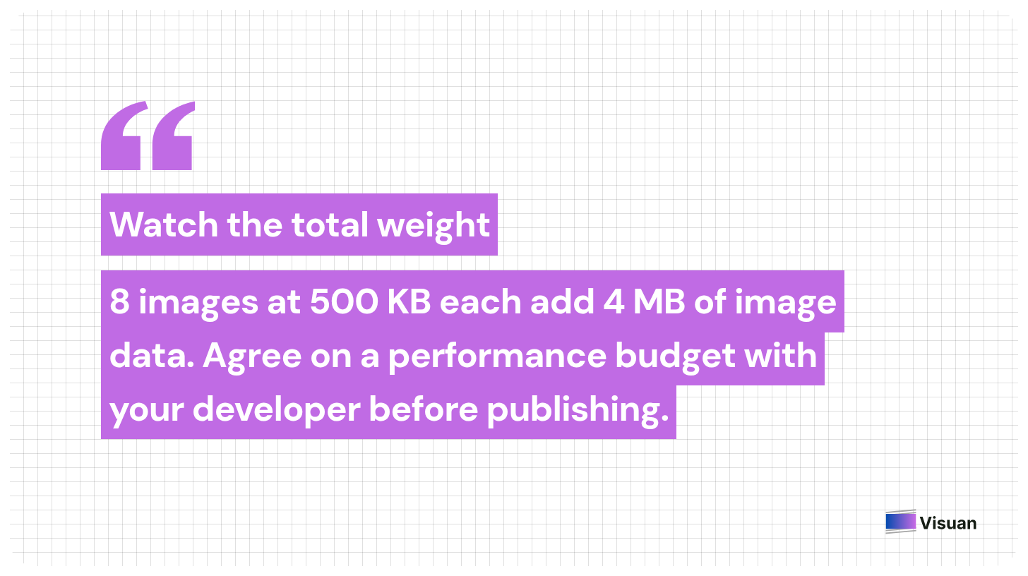
As a simple illustration, eight images at 500 KB each add about 4 MB of image data. Use that total when discussing the page with your developer. Agree on a practical performance budget for your site and test the result on a mobile connection.
Ask whether the CMS serves appropriately sized image variants to different devices. Confirm that it reserves space for images before they load, so the surrounding text stays in place. MDN explains how width and height attributes help prevent these layout shifts.
Images farther down the article can usually load as readers approach them. Keep the main image visible on arrival loading promptly. Applying lazy loading indiscriminately can delay the content someone came to see.
How do you optimize blog images for SEO?
Make images discoverable and describe their meaning in context. Clear filenames and useful text alternatives support that work alongside the surrounding article.
Write descriptive filenames and captions
Name the image after what it shows, then use the caption to explain why it matters. These fields serve different reading needs.
For an onboarding diagram, a filename such as customer_onboarding_workflow.webp identifies the subject. A caption might explain that account setup comes before the first shared project. Use the caption to communicate that specific point.
Add a source link when the image presents research or an example from another organization. If you adapted the material, label the adaptation so readers can distinguish your presentation from the original.
Describe the meaning in alt text
Write alt text that conveys an image’s purpose within the article. The right description depends on what readers need to understand at that point.
For an annotated screenshot, an example could be: “ Export menu with the Download PDF option highlighted”. That describes the detail relevant to the instruction. Mentioning every item in the toolbar would add little value to that particular task.
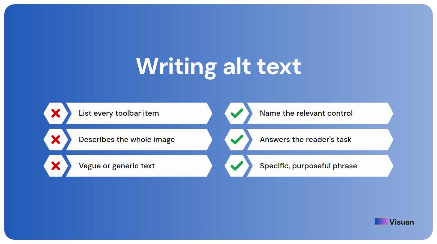
For an image used as a link, describe the destination or action when the image provides the link’s only accessible label. A purely decorative image generally needs an empty alt attribute.
Keep complex information available as text
Give charts and detailed diagrams an accessible text equivalent. A brief alt description cannot always communicate all the information in a complex graphic.
W3C recommends a short description plus a fuller explanation for complex images. For a chart, you can provide the underlying values in a nearby table. For a process diagram, explain the sequence and any decision points in the article.
This is especially useful when an image summarizes a framework. Readers can copy a checklist or search the page for a specific step when that information also exists as normal text.
Confirm that search engines can discover the image
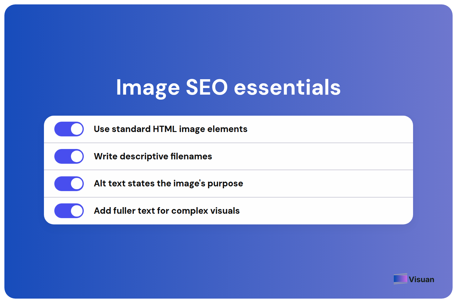
Publish content images through standard HTML image elements with accessible image URLs. This is a useful check for whoever maintains your blog template.
Google’s image SEO guidance says it can discover images through an image element’s source attribute and does not index CSS background images. Ask your developer to verify how the CMS embeds the graphics inside your articles.
The same guidance recommends descriptive filenames and contextual alt text. Include a keyword when it accurately describes the image. Repeating the article’s target phrase across every alt field adds no useful description for someone relying on those alternatives.
Try it with an article you already know
Start with one existing article and use Visuan to generate its blog images. Familiarity with the content will help you judge the results.
Keep the graphics that make a specific point easier to understand. Refine the wording where needed, then preview them beside the relevant sections. You’ll have a concrete basis for deciding how Visuan fits your publishing workflow.
Try Visuan free with your article.
FAQ
How do I create images for a blog post?
Start with a point in your article that would be easier to understand visually. Choose a suitable format, such as a process diagram for a workflow or a comparison graphic for two options. Place the finished image beside the relevant passage and check its readability on mobile.
Can I use AI to create blog images?
Yes. Visuan reads your article and generates branded blog graphics in one click once your brand kit is set up. It also writes the copy for each visual. Review the results against your draft before publishing to check that they preserve the meaning of your content.
How many images should a blog post have?
There is no fixed number. Use images wherever they help explain a point. A software tutorial may need screenshots for several steps, while an opinion article could work with a cover and one supporting chart. Each image should have a clear reason to appear.
What size should blog images be?
Base the dimensions on the width of your blog’s content column. For an image displayed at 800 pixels wide, a 1,600-pixel-wide export can improve sharpness on high-resolution screens. Check your mobile preview separately to make sure every essential label stays readable.
What is the best file format for blog images?
The best format depends on the content of the image. WebP and AVIF can reduce file size while preserving suitable quality. For screenshots or graphics with small text, compare PNG with lossless WebP. Choose the export that keeps important details clear at a reasonable file size.
How do I optimize blog images for SEO?
Give each image a descriptive filename and place it beside relevant article text. A filename such as customer-onboarding-workflow.webp identifies the subject of an onboarding diagram. Add alt text that explains the image’s purpose, using your target keyword only when it accurately describes the content.
Can I edit the blog images Visuan generates?
Yes. Visuan’s text layers are editable, so you can adjust wording without regenerating the whole image. Use the source paragraph to check that each edit preserves the original meaning. After making changes, review the line breaks at the size the image will appear in your blog.
Can I reuse blog images on LinkedIn?
Yes. Choose a visual that readers can understand without the full article, adding any context it needs to make sense on its own. Visuan can also turn your article into LinkedIn visuals and carousels, with PDF export for carousel uploads.
.png)


Subscribe to the Visuan newsletter
Get product updates and content tips, straight to your inbox.